
 Team
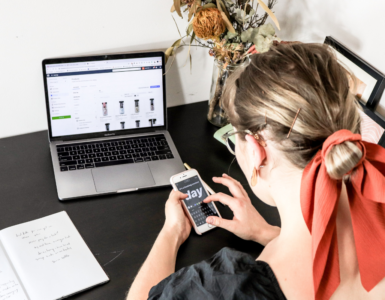
TeamToday, we usually use mobile devices to access the internet. They are easy to carry and you can access the internet wherever you are. However, if you are a web developer, things are not that simple. You need to customize a web page to be visible on other devices. In other words, the website should be responsive.
Today, the vast majority of websites are adapted exclusively for desktop computers. Since people usually use their smartphones to search the web, mobile-friendly websites are also very popular. Simply put, a modern website should be customized for mobile phones, tablets, laptops, and PCs.
According to Global Stats, the most commonly used resolutions are 1920×1080, 1336×769, and 360×800. Of course, there is a wide range of other different resolutions at which your website should look good.
As you can guess, the main goal of every web designer is to make a responsive website that can match all these resolutions. This can be a difficult task. But thanks to modern tools, you can easily create a mobile responsive website.
If you want to quickly create a web page or web application, you should try Bootstrap. Bootstrap is a front-end framework. It is a mix of CSS and HTML rules and JavaScript extensions. It provides modern typography, forms, buttons, tables, navigation, animations, and everything you need for responsive web design.
Therefore, in this article, we are going to help you learn the most common Bootstrap classes. By using these, you will be able to create a basic website in just a few clicks!
The Best Bootstrap Classes
Bootstrap use already made classes. It is up to you to learn their names and use them while working on a new website. In any case, the knowledge of basic HTML tags is also required in order to place a particular element on the page properly.
Bootstrap Installation
Instead of downloading and installing Bootstrap, you can use CDN. CDN stands for Content Delivery Network. It is a much simpler way to install this framework. You only need to use a link and several scripts to make Bootstrap avaliable. So, paste the following code in between the HTML head tags:
<link rel=”stylesheet” href=”https://maxcdn.bootstrapcdn.com/bootstrap/3.3.7/css/bootstrap.min.css”>
<script src=”https://ajax.googleapis.com/ajax/libs/jquery/3.2.1/jquery.min.js”></script>
<script src=”https://maxcdn.bootstrapcdn.com/bootstrap/3.3.7/js/bootstrap.min.js”></script>
That it is! You are ready to use Bootstrap classes and make your first mobile responsive website.
Container and Container Fluid

Bootstrap places all website elements in so-called containers to prevent content overflow. Containers are actually div tags with the appropriate classes. There are two types of containers: container and container-fluid.
The .container class gives us a responsive fixed-width container.
<div class=”container”>
…
</div>
On the other hand, the .container-fluid class creates a container that extends through the entire width of the viewport.
<div class=”container-fluid”>
…
</div>
Grid System Classes
Bootstrap works with 12 columns. The width of the columns is automatically adjusted to the width of the screen. This is why is Bootstrap is a great tool for making responsive websites. You don’t need to write a lot of repetitive code to make your website responsive. Instead, you can use the following grid system classes to make a responsive grid.
So, let’s find out which classes to use to set up the grid system for different types of devices:
- .xs (mobile devices – screens smaller than 768px)
- .sm (tablets – screens with a width greater than or equal to 768px)
- .md (small laptops – screens wider than or equal to 992px)
- .lg (standard laptops or desktops – screen width greater than or equal to
1200px)
<div class=”container”>
<div class=”row”>
<div class=”col-sm-6“>
This is the first column.
</div>
<div class=”col-sm-6″>
This is the second column.
</div>
</div>
</div>
As you can see in the example above, if you open a web page on a tablet or larger screens, it will have two identical columns.
Tables
It is very simple to make a responsive table with Bootstrap. You only need to use the HTML tag <table> and a Bootstrap class .table. Of course, there are different types of tables and their classes. For instance, you can create a dark table (.table-dark), bordered table (.table-bordered), hoverable table (.table-hover), etc.
Buttons
Besides tables, you can create buttons. Again, you can start with the HTML tag <button> along with a particular class. For instance, if you want to create a blue button, you can use a Boostrap class .btn btn-primary. In this example, there are actually two classes, btn – the Bootstrap button class, and btn-primary for the blue color of the button.
<button type=”button” class=”btn btn-primary”> This is a blue button. </button>
When it comes to colors, there are several predefined Boostrap colors, such as btn-secondary (grey), btn-success (green), btn-danger (red), and so on.